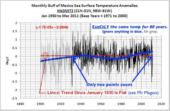
“Are Gulf Of Mexico Sea Surface Temperature Anomalies Near To Record Levels?” As Anthony Watts foolishly suggests in his one sentence contribution to Bob Tisdale’s guest post, “the devil is in the details.” He is indeed…
Bob is trying to dispute the claim by meteorologist Jeff Masters that the recent Midwest deluge [was] enhanced by near-record Gulf of Mexico sea surface temperatures. Although Jeff is talking about weather, Bob Tisdale recognizes the threat. This might mean that global warming really is happening! Of course it’s not, so he accuses Jeff of a “contrived” claim and counters that “…over the past 80 years, there is no global warming signal in the Gulf of Mexico SST data.”

My blue trend is just eyeballing but it's a lot less contrived than Bob Tisdale's flat red line in this example from his "analysis".
Unfortunately for Bob any open-eyed reader will see that every chart he tries to use as evidence reveals that he has deliberately picked dishonest comparison points that minimize the increase and he has ignored everything in-between. Details, details.
Statistics, Bob. Look into ’em. There’s a reason scientists use ’em.


WATCH FOR IT…………………….To help remember this pattern, the instrumental global temperature graph is available at Global Warming Art:
http://www.globalwarmingart.com/wiki/File:Instrumental_Temperature_Record_png
Notice how the graphs are: up to a ~1940peak, then down to a 1975+ low, and then up again. In some there is even a suggestion of the secondary peak in 1960.
Thank God Corexit prevented the “black” crude from absorbing even more energy to the surface layer! But clearly there was some left since the flood isn’t related to global warming at all.
Pingback: The Silliest Rebuttal Yet From Ben At Wott’sUpWithThat | Bob Tisdale – Climate Observations
I’ve made many comments in the past pointing out the presence in the data of the global temperature pattern…in WUWT graphs that are given straight line interpretations.
Ordinarily I only look for the last three lengths in the global temperature graph: up to 1943, haphazardly down to 1976, and then up again.
There are more.
Global Temperature Anomalies, degC, 5 year average,
read from graph on screen. End eyeballing here justified by the crudities in the visual analysis.
[1880 -0.28 eyeballed beginning of global graph]
down
1892 -0.37 low
up
1898 -0.24 high
down
[1900 -0.26 beginning of century]
down
1908 -0.42 overall low
up
1943 +0.03 high
down
1950 -0.13 first of 3 lows surrounding 1960
up
1960 -0.03 interim high
down
1976 -0.08
up
[2000 +0.37 end of century]
up
2010 +0.49 eyeballed end of global graph
Obviously this is ad hoc and not rigorous. And not convincing for those who don’t take the time to try it.
But, while subjectively objective, and despite exceptions, I see more of the global temperature pattern in the Gulf of Mexico graphs.
SHOW DON’T TELL…………………….The obvious next step is to reduce the global temperature graphi’s vertical height to match the Gulf of Mexico graph. And to make the horizontal scales the same.
And overlay the one on the other.
This visual analysis will be easier to do from a shortened listing of the global temperature pattern, in the same eight segments.
A paper copy of this would make it easier to use, because of all the back-and-forthing. As would a print out of the original global temperature graph.
Beginning in 1880
down till 1892 low
up till 1898 high
down till 1908 overall low
up till 1943 high
down till 1950 low
up till 1960 interim high
down,up,down till 1976 low
up till 2010 overall high
Trying it out on Figures 11 and 15 suggests that an overlay of global temperature would be successful.