Pat Frank: The New Science of Climate Change

Pat Frank: The New Science of Climate Change (May 14, 2011). Anthony Watts’ blog buddy “John A” wants us to read chemistry PhD Pat Frank’s May 6th post on Jeff Id’s blog (ah, “social networking”). It proves that Global Warming is all just fiddling by them dang lyin’ climate scientists. They adjusted the early 20th century surface temperatures upwards to create the appearance of a late-century warming trend! What sneaks.

This increase in rate wasn’t due to an accelerating late 20th century trend. It’s mostly due to modifications of the 1880-1920 record.

Wait, haven’t the denialists been claiming that early instrument records were adjusted downwards to maximize apparent warming? Could it be that they’re adjusting in both directions at once? It staggers the mind.

Pat Frank’s rigorous scientific technique is to scan the published graphics and convert them to numerical values. How this is supposed to inspire confidence in his conclusions remains unknown because Frank offers no discussion of the reasons for changing the data selection that produced the plots. I suppose that would take both knowledge of the details as well as scientific insight.

His accusation is that the earliest instrument data was ‘adjusted upwards’ by GISS  from earlier presentations to fraudulently lower the slope of early century warming and make post-1975 AGW warming look comparatively steeper. So Frank adjusts the values in the direction that suits him by cherry-picking some starting points (What’s special about 1950? Nothing.), adds in some x-axis squashing for more visual minimization, and declares victory. Now that’s post-normal.

This all boils down to more accusations of “Post-Normal Science”, which denialists like to sling about when ever climate scientists refine their theories or improve historical analyses. Any change in “the record” is malicious don’t you know.

I wonder why Frank doesn’t discuss Total Solar Irradiance, which was increasing during the early part of the century and level later in the century when all the Global Warming happened? After-all he does make a half-hearted stab at blaming the warming on “solar variation”.

Stanford claims farmers “dodged impacts of global warming” in the USA, but you have to find it first.

Stanford claims farmers “dodged impacts of global warming” in the USA, but you have to find it first. (May 6, 2011). When Anthony Watts does his own posting you can be sure that it will be short and dishonest. Here Anthony disputes a Stanford University report on the impact of global warming on US crop production, which states:

Global warming is likely already taking a toll on world wheat and corn production, according to a new study led by Stanford University researchers. But the United States, Canada and northern Mexico have largely escaped the trend.

Anthony rebuttal is to slap together charts of US corn yield and US temperature to “prove” that noisy regional weather data shows no global warming. He also alludes to the comical “CO2 is essential for life” argument.

Yep, US corn yields are going up. It’s gotta mean something! Anthony grudgingly allows that “some of the gains seen below are likely the result of improved seed lines”, but the honest first approximation is that all of corn yield gains are “likely the result of improved seed lines”. After-all he’s pretty sure that there hasn’t been any change in the climate, isn’t he? Sez Anthony:

What global warming? The last two years of annual mean temperature for the USA (2009, 2010) is about the same as it was in 1980 and 1981, and lower than many years since.

So Anthony’s entire argument is to compare two years of the US annual mean temperature, 1980 and 1981, against the two most recent years and declare that since they are “about the same” this proves that there’s no global warming? Dude, you’re a frickin’ cherry-pickin’ idiot.

Anthony’s lame “we’ve seen exactly this before” deception is only faintly plausible if he deliberately removes the default trend line from his chart. We can fix that though (replicate it here, but ignore Anthony’s advice to exclude the trend line):

Anthony Watts took care to remove the trend from his version of this chart.

As usual Anthony’s also using several levels of cherry-picking to gin-up his “What global warming?” climate claim aside from the two-year comparison windows. The US Corn Belt is not the same geographic area as the continental US, so he’s not demonstrating anything at all about the Corn Belt climate. Likewise, the continental US represents only a fraction of the global record.

The Stanford article also mentions an US trend towards anomalously cooler summers, which coupled with the unequivocal rise in annual average temperature implies warmer winters. US agriculture has been partly insulated from global warming by keeping the growing season temperatures within the crop’s tolerance zone. Why didn’t Anthony address that? Hmmm.

The GISS divergence problem: Ocean Heat Content

The GISS divergence problem: Ocean Heat Content. Butter wouldn’t melt in citizen-scientist Bob Tisdale’s mouth, would it? He’s back with new proof that there’s no global warming and that them gubmint scientists is stupid. Anthony Watts approvingly notes the alleged “[denialist] reality versus [Goddard Institute for Space Studies] projection disparity” and declares “a GISS miss by a country mile.” Game over, yuck, yuck, yuck!

Tisdale’s claim is that Ocean Heat Content (OHC) hasn’t risen as fast as an old GISS model projected (note that this was not a prediction). Why? Well, because he can slap a projected straight line (Bob still loves ’em) on a chart that rises faster than the observations. Therefore, warmists are liars and their computers are too. This handily side-steps the real issue: Ocean Heat Content is unquestionably rising. We call this global warming.

Except… Even Anthony has to give Bob a nudge in the comments for failing to admit that his citizen-science fair project is showing “anomalies” i.e. deviations from the trend and not the trend itself. Sure, the target man on the street won’t spot it, but it’s like plastering “kick me” all over your own back for the benefit of informed scientific observers like Tamino, to whom Bob’s posts are like candy to a baby. Tamino indulges his sweet tooth in Favorite Denier Tricks, or How to Hide the Incline.

So how does Tisdale think he’s proven that the alarmist GISS projection of increasing OHC doesn’t match the measured increase? By using the classic denialist trick of showing the projection over a very particularly chosen time period from on a very particularly chosen point. This allows him to imply that OHC is flat but the GISS projection is increasingly divergent from “reality”. Anthony is silent on the this half of Bob’s deception because in the denialist playbook cherry-picking is enthusiastically endorsed.

The following graphic collates Tamino’s deconstruction of Bob Tisdale’s game-playing. Perhaps Bob should submit his work to the National Science Fair’s Beeville branch?

New cherry-picking and tunnel vision from Bob "Magoo" Tisdale. Deconstruction by Tamino.

Are Gulf Of Mexico Sea Surface Temperature Anomalies Near To Record Levels?

Are Gulf Of Mexico Sea Surface Temperature Anomalies Near To Record Levels?” As Anthony Watts foolishly suggests in his one sentence contribution to Bob Tisdale’s guest post, “the devil is in the details.” He is indeed…

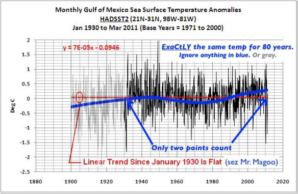
Bob is trying to dispute the claim by meteorologist Jeff Masters that the recent Midwest deluge [was] enhanced by near-record Gulf of Mexico sea surface temperatures. Although Jeff is talking about weather, Bob Tisdale recognizes the threat. This might mean that global warming really is happening! Of course it’s not, so he accuses Jeff of  a “contrived” claim and counters that “…over the past 80 years, there is no global warming signal in the Gulf of Mexico SST data.”

My blue trend is just eyeballing but it's a lot less contrived than Bob Tisdale's flat red line in this example from his "analysis".

Unfortunately for Bob any open-eyed reader will see that every chart he tries to use as evidence reveals that he has deliberately picked dishonest comparison points that minimize the increase and he has ignored everything in-between. Details, details.

Statistics, Bob. Look into ’em. There’s a reason scientists use ’em.

It’s probably nothing*

It’s probably nothing*“. Anthony Watts tries to slide another stupid “Snow! Somewhere!” post by as just a little “humor“. Apparently busy denialist copy-and-paster Tom Nelson noted that there was lots (41 inches) of ice in Nenana, Alaska (which is in the Arctic you know) on April 21st this year. But the ice was all gone by that date in 1940! Therefore global cooling.

Nenana has held an annual draw to guess the date of spring breakup on the Tanana River for a century now, and this is Anthony’s new gold standard for global climate data.

Like most northern rivers, the Tanana’s spring ice breakup is almost entirely dependent on flow volume during the spring run-off. The ice broke up, at a thickness of 39″, just four days after this astonishing climate evidence was presented. Also at 64°N Nenana is below the Arctic Circle.

Willis Eschenbach accidentally undermines Anthony's "humor".

Anthony’s teammate Willis Eschenbach creates the real punchline by inserting a chart (above) that shows that ice break up on the Tanana River is clearly trending to earlier dates. Or maybe he just can’t understand his own work.

I guess Anthony’s readers aren’t subtle enough to follow Anthony’s attempt at humor; they’re reacting with stolid earnestness.

Union of Concerned Scientists – Unwarranted Concern about the Northeast US

Union of Concerned Scientists – Unwarranted Concern about the Northeast US. A guest post by Alan Cheetham of Appinsys (an unskeptical version of Skeptical Science, with an interest in portraits of Mohammed). Did you know that the Union of Concerned Scientists, who are just washed-out librul anti-nuke gravy-train types, has been exaggerating climate change in the Northeastern USA? (Nothing to say about the rest of the world?)

[Across the globe, and] “here in the Northeast, the climate is changing. Records show that spring is arriving earlier, summers are growing hotter, and winters are becoming warmer and less snowy. These changes are consistent with global warming, an urgent phenomenon driven by heat-trapping emissions from human activities.” – 2006, from climatechoices.org

“In fact”, there has been no trend in temperature change there in a hundred years, and sometimes the “record” was, like, years ago!

Cheat-sheet:

  • When denialists like Anthony Watts and Alan Cheetham want to present the illusion of a recent cooling period, they will reduce the number of years of temperature data until they can.
  • When denialists like Anthony and Alan want to hide recent (post 1975) AGW warming, they increase the number of years they present.
  • Denialists like Anthony and Alan will always cherry-pick a convenient location and claim that it disproves a global trend.
  • Denialists like Anthony and Alan will always fixate on an outlier if it suits their argument, the wilder the better.

Unfortunately for Anthony, in this case the “trick” is in plain sight. In all “flat” temperature graphs the trend from 1975 onwards is a rising one. Here’s an example, the “summer” temperature trend:

Alan Cheetham's "flat" temperature trend — of just the northeast USA because nothing else exists — with post-1975 trend indicated.

I guess we should listen to the Union of Unconcerned Scientists.

2010 – where does it fit in the warmest year list?

2010 – where does it fit in the warmest year list? Christmas Guest pudding from Geology Professor Dr. Don Easterbrook. Apparently 2010’s record temperature is “really much to do about nothing.” After-all, if you go back 10,000 years you can find plenty of warmer years. I guess the denialist leg-puller about only needing to look at the last 15 years is out of favor now that 2010 can’t still be brushed aside.

What strikes me in all of Easterbrook’s sloppy “data” is that, at a time when the Earth should now be following a pronounced cooling trend it is emphatically not. Wiggle your way out of that one, Professor.

There are enlightening insights into Easterbrook’s scholarship at Only In It For The Gold (Garbled Reasoning at WUWT) and Hot Topic (Easterbrook’s Wrong (Again)), but I’ll leave the technical criticism to this comment in the Watts Up With That post by “BillD”:

Where is peer review when you need it? This post conflates the global climate record with regional records for the US and Greenland. Then it fails to point out that “present” only goes up to 1905. Over the last 21 years, I have been the editor or reviewer for over 600 manuscripts submitted for publication in peer-reviewed scientific journals (I need to keep a record for my employer). I have to say that I have never seen a submitted manuscript with such blatant errors as in this post. Even submitting a manuscript such as this would be damaging to one’s career and would certainly cause the loss of all credibility with the journal’s editor and the reviewers if any (In most cases the editor peruses a manuscript to check it’s suitability for the journal and to decide on expert reviewers. These kinds of errors and misleading comparisons would almost certainly lead to rejection by the editor, without even sending the ms. out to reviewers).

Even Dave Springer, a Watts Up guest author, comments unhappily (emphasis mine):

The new guest author program, which include myself as one of those new guest authors, appears to have fostered a greater need for internal peer review before the articles are published. Anthony and Willis and guest authors like Spencer and Lindzen didn’t seem to need much in the way of peer review but with this new influx of guest authors the comments are now stuffed with repetitious exposure of errors in the articles.

Is Prof. Easterbrook really so sloppy? Or his he more concerned with finding a story that he can enjoy telling?

Confirmation of Solar forcing of the semi-annual variation of length-of-day

Confirmation of Solar forcing of the semi-annual variation of length-of-day. December 23rd gave us Anthony Watts’ first Christmas Guest, and Paul Vaughn (M.Sc.) served up a delightful slice of Dunning-Kruger pudding. There’s nothing a denialist likes more than a new and obscure correlation to (briefly) divert the conversation… Causation is for sissies.

Paul wants to show that Earth’s Length of Day is influenced by cosmic rays, which slightly affect atmospheric density. Hence, using the power of wishful thinking, all Global Warming is natural and will reverse itself. Eventually. Paul gives us lots of cluttered stock promoter-style charts, spreading a tiny proportional change over a full chart range. You’d think an analytical genius like, perhaps, Steve McIntyre would call him to task on it wouldn’t you?

Yes, atmospheric and oceanic angular momentum impacts Length of Day. Trivially. This influence, measured as being on the order of one millisecond out of 86,400,000 over a period of months, is significant? Try again. Cue the ignorant arguments about magnetic fields in the comments.

Australia’s white summer, Monbiot’s red fury

Australia’s white summer, Monbiot’s red fury. Watt a surprise, Anthony Watts drawing our attention to a freak weather event in Australia. This must surely prove that there’s no Global Warming! Anthony also stretches his mental capacity to compare the size of Australia to America and to Europe. Anthony is mad that environmental reporter George Monbiot consulted “the kids at the Climate Rapid Response Team“, aka professional climate scientists, to understand this Australian weather. How dare he!

Don’t you know that if you cherry-pick a small enough smoothing radius you can make big holes appear in the global temperature data maps? I’m surprised that Anthony doesn’t try to claim that all smoothing is false and present a temperature data map with 99.9% “no data”.

Changing your color scheme to assign ‘bluer’ colors to warm temperatures also helps make things look ‘cooler’. Presumably Anthony thinks that every year those corrupt mainstream climatologists have been slightly changing their color schemes to look make the same temperatures look ‘redder’.


Hmmm... Dr. Spencer's map is pretty red. He must be in on the plot now too.


Anthony has to come up with something to distract from the fact that 2010 has proven the hottest year in the instrument record even with only a moderate El Niño influence. (Note: who cares about one year? That’s a denialist distraction. It’s the long-term trend that matters.)

Further more, we learn that the weather stations in remote Greenland communities are clearly affected by the urban heat island effect. Anthony’s speculation proves it! (Maybe this particular rant was a bit of nostalgia for the old days when Anthony regularly tried to get away with this UHI b.s.)

A helpful note to Dr. Eric Steig

A helpful note to Dr. Eric Steig. Anthony Watts casts about for something critical to say about “perfesser” Eric Steig, whose 2009 paper on Antarctic warming trends was supposedly refuted by Anthony’s team-mates, O’Donnell, Lewis, and McIntyre. In this case “refuted” means that they packaged the data slightly differently and got slightly different warming trends. Thus revealing once and for all (the denialists shouted) that Global Warming isn’t happening.

Here’s the response to a comment by “MapleLeaf” at Real Climate that has Anthony foolishly yelling “gotcha!”

And why did WUWT show an image that appears to have less warming than the one shown here by Eric? Sorry but I have to fault you both there..the figures should show for what season they are valid, or if they are for annual temperatures.

[The figure here shows O’Donnell’s et al.s reconstruction for the same time period as our Nature cover image. These are annual mean estimates. I cannot speak to WTF WUWT has done.–eric]

So what is Anthony’s “gotcha” advice to Dr. Steig? It wasn’t Anthony who used temperature color bands that visually minimized warming in the Antarctic temperature anomaly map shown on Watts Up With That, it was someone else! Ooh, snap! Anthony just blindly copied and pasted it, like the alert “skeptic” he is, so you can’t blame him for any graphics shenanigans. Take that “perfesser”, you were impugning the wrong website!

There was much denialist lip-licking when this paper was in preparation. Finally the virtuous scientist-citizens were going to show the corrupt climatologists how to do science… Too bad that in the end the authors had to conform to reality and found themselves the proud owners of a dud. From O’Donnell’s closing comments:

In my opinion, the Steig reconstruction was quite clever, and the general concept was sound.

Poor  Anthony’s looking for a way to pretend the denialist firecracker didn’t fizzle.