When the IPCC disappeared the Medieval Warm Period

When the IPCC disappeared the Medieval Warm Period” Frank Lansner offers a limp implication of conspiracy theories against the IPCC. Anthony Watts thinks it’s good stuff. Frank’s own website is “Hide the Decline”, so you can see the debunked starting point that he’s coming from…

Where's the warm spot Frank? 1000 - 1400 can be colder or warmer even among your "selected" data sets. How is this IPCC manipulation?

It’s funny that we have to keep saying this, but the “IPCC” doesn’t do any climate research, they gather independent scientific conclusions and amalgamate them. The whole point of each revision of the IPCC reports is to merge new evidence and better understanding of existing evidence.

But Frank thinks that accusing the IPCC of differences between reports(!!!) is the same thing as proving manipulation. I think Frank would have better luck with his position if he stopped hunting for charts that he can spin to suit his bias and focussed on what actually drove the updates. You know, things like when new data was available or if a more correct interpretation of old data was found or perhaps the introduction of an improved error correction. But as nothing remotely like this is apparent in his post, we must assume that he’s incapable of doing it.

NSIDC Reports That Antarctica is Cooling and Sea Ice is Increasing

NSIDC Reports That Antarctica is Cooling and Sea Ice is Increasing“. The always entertaining Steven Goddard pastes up a few maps and tries to use them to claim that they “seem to point” to modest cooling in the Antarctic. Thus proving that there is no global warming. Even though there has been some sea ice loss. And ignoring the impact of the “ozone hole“.

We dealt with this stuff just a few hours ago. Regional, not global. Known to be sensitive to non-temperature driven factors. Ignores other relevant contributing factors.

Remember when the global warming denialists were all fighting against the evidence that ozone emissions were damaging the atmosphere?

On the “march of the thermometers”

On the “march of the thermometers”. Missed this one. Anthony Watts pointing to “the hard work of E. M. Smith” on ‘dropped’ weather station records. The accusation is always that stations that are warming faster are being kept, those that are cooling are being maliciously discarded.

Funny, they never seem to mention two things about this:

  1. The ‘dropped’ stations are stations that aren’t automatically uploaded to the weather databases. They are in fact added intermittently by infrequent manual processes. This means that a station will be in the database, seem to be dropped, and then at a later date reappear with all the intervening years of data.
  2. The trends for the “dropped” stations and the “kept” stations are the same. The only conclusion that can be drawn is that “colder” stations are more likely to need intermittent manual incorporation into the data set because they are more likely to be remote.

For more on this foolishness, go over to the “Dropouts” post on Open Mind and give your head a shake.

IPCC AR4 Commenter: “I do not understand why this trend is insignificant – it is more than three times the quoted error estimates”

IPCC AR4 Commenter: “I do not understand why this trend is insignificant – it is more than three times the quoted error estimates”. Chip Knappenberger found an error in the IPCC AR4 Chapter 4 First Order Draft! The draft said:

“The Antarctic results show a slight but insignificant positive trend of 0.7 ± 0.2% per decade.”

Dr. John Church said ‘hey, isn’t that significant?’ Therefore the IPCC are liars! They’re now up to 3 alleged errors out of thousands of evidentiary statements! Or is it 4 alleged errors? They’re coming in so fast (not) that I can’t keep up. As an aside I have to say members of the climate conspiracy who actually scrutinize our overlord’s statements won’t get their bonus cheques. Follow your scripts people!

Here’s the final version (emphasis mine). Damning, or… not?

The negative trend in the NH is significant at the 90% confidence level whereas the small positive trend in the SH is not significant (updated from Comiso, 2003).

A fuller statement (both are from page 351 – page 15 of the PDF – of Chapter 4 of Climate Change 2007: The Physical Science Basis. Contribution of Working Group I to the Fourth Assessment Report of the Intergovernmental Panel on Climate Change) is this:

There is a significant decreasing trend in arctic sea ice extent of -33 ± 7.4 × 10³ km²/yr (equivalent to -2.7 ± 0.6% per decade), whereas the antarctic results show a small positive trend of 5.6 ± 9.2 × 10³ km²/yr (0.47 ± 0.8% per decade), which is not statistically significant.

Sea Ice Extent, Northern & Southern Hemispheres. Pg 351, Chapter 4: The Physical Science Basis of IPCC AR4. Which trend is significant?

The second part of this accusation is that any increase in Antarctic sea ice is proof of “no warming” and a disproof on the criminal climate model predictions. Sorry, this is not a predicted response. The Antarctic sea ice is known to be more sensitive to ocean circulation than it is to temperature. This has been discussed as far back as 1992 (Manabe et al., 1992).

February UAH global temperature anomaly – little change

February UAH global temperature anomaly – little change“. Dr. Roy Spencer admits that the globally averaged satellite record of lower atmosphere temperature is still going up. But he invokes Dr. John Christy’s rambling discussion of pending possible “corrections” to conclude that we should continue to ignore the trend.

Still going up, but there's no El Niño to excuse it...

Baltic sea ice traps ships

Baltic sea ice traps ships“. Ice exists, thus disproving man-made global warming. That’s Anthony Watts’ frequent refrain. Whatever.

Anthony also mentions Richard North’s post on the event, which cosily refers back to Anthony’s posts. It’s a pretty tight orbit in the denialosphere…

Spencer: Using hourly surface data to gauge UHI by population density

Spencer: Using hourly surface data to gauge UHI by population density“. Dr. Roy Spencer has realised that “forsaking blindingly technical statistics” isn’t a practical position and has come up with an analysis, using one(!) year of data, that correlates “warming bias” of  station temperature records with population density (Urban Heat Island!). Population density is “presumed to be related to how much the environment around the thermometer site has been modified over time” (emphasis mine). That’s a rather big presumption. There are plenty of other simplistic adjustments in Dr. Spencer’s data, such as a blanket 5.4°C per 1000m increase in station elevation adjustment. Dr. Spencer has shown before that he has problems using statistics correctly, so it will be interesting to see if this stands up, but given Dr. Spencer’s track record I’m going to bet on “confirmation bias“.

Dr. Spencer makes a dangerous statement though: “Note that the philosophy here is not to provide the best adjustments for each station individually, but to do adjustments for spurious effects which, when averaged over all stations, will remove the effect…” (emphasis mine). He’s setting himself up as a target for exactly the same weather station correction nitpicking that Anthony has played with the USHNC’s weather station data. Will Anthony hold him to the fire?

Anthony inadvertently answers this question with “I believe this is a truly important piece of work” in spite of all dodgy assumptions Dr. Spencer admits to. Also, his blogging about Spencer’s draft should be considered as an “early peer review.” I will support Anthony’s hope that “Dr. Spencer will submit it to a journal” though. I think I’ll enjoy watching what is effectively another “sciency” attempt at Anthony’s failed surfacestations.org project be subjected to legitimate scientific scrutiny.

2001-2010 was the Snowiest Decade on Record

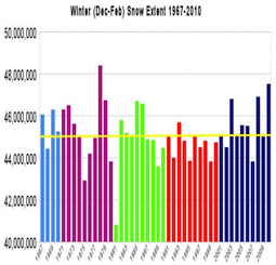
2001-2010 was the Snowiest Decade on Record“. Steven Goddard’s “guest posts” on Anthony Watt’s blog are getting embarrassing. He’s still going on about how much snow there is! He even accuses Al Gore of ineptitude. Now that’s rich… Steven, you’ve got issues. Big issues. Emotional issues as well as intellectual ones.

Steven’s data comes from the Rutgers University Global Snow Lab. The closest he comes to explaining his climate change claims is this: A decade long record across the entire Northern Hemisphere is not appropriately described as a “snowstorm.” Actually, unless Steven can slap some legitimate statistical trends on this claim it’s just as likely a “snowstorm.” He once again has bupkis. Looks like Steven’s going to have the bupkis market locked down pretty tight.

Steven's yellow line has no meaning, it's just a visual "trick" to create the illusion of an anomaly.

Ignoring the regionality of his claim, his invented threshold of 45 million km² snow extend, and the lack of any evidence of statistical significance, how does any of this undermine the factual evidence of AGW? You know the answer.

Phil Jones on the hot seat – not sharing data is “standard practice”

Phil Jones on the hot seat – not sharing data is “standard practice”. Actually Anthony, the Daily Mail reports that Dr. Jones “admitted withholding data about global temperatures but said the information was publicly available from American websites.”

Anthony also lets Steven Mosher weigh in with more ‘he said, she said’ quote mining.

Still no suggestion that his scientific conclusions are in any way incorrect, even after months of stunningly intense denialist assaults.

BWI snow record rescinded: Another reason why airports aren’t the best place to measure climate data

BWI snow record rescinded: Another reason why airports aren’t the best place to measure climate data“. Chicago’s O’Hare airport is bigger than it used to be, although its weather records aren’t used for climate analysis. A weather observer in Baltimore followed the wrong guidelines for recording snowfall.

These two irrelevant factoids apparently confirm Anthony Watts’ distrust of all gubmint weather records.