
“Arctic Sea Ice Reports: who to believe?” Anthony Watts implies deception about Arctic sea ice extent because different organizations (the EU’s “Arctic ROOS” and The National Snow and Ice Data Center at the University of Colorado), using different comparison periods and different methodologies, have slightly different ice extent graphs.
Anthony actually discusses the differences between two methods of calculation, which you’d think would be a starting point for realising that they’re different. But he prefers to lazily imply ulterior motives with statements such as this: “Of course we know that NSIDC director Mark Serreze is very active with the press.”
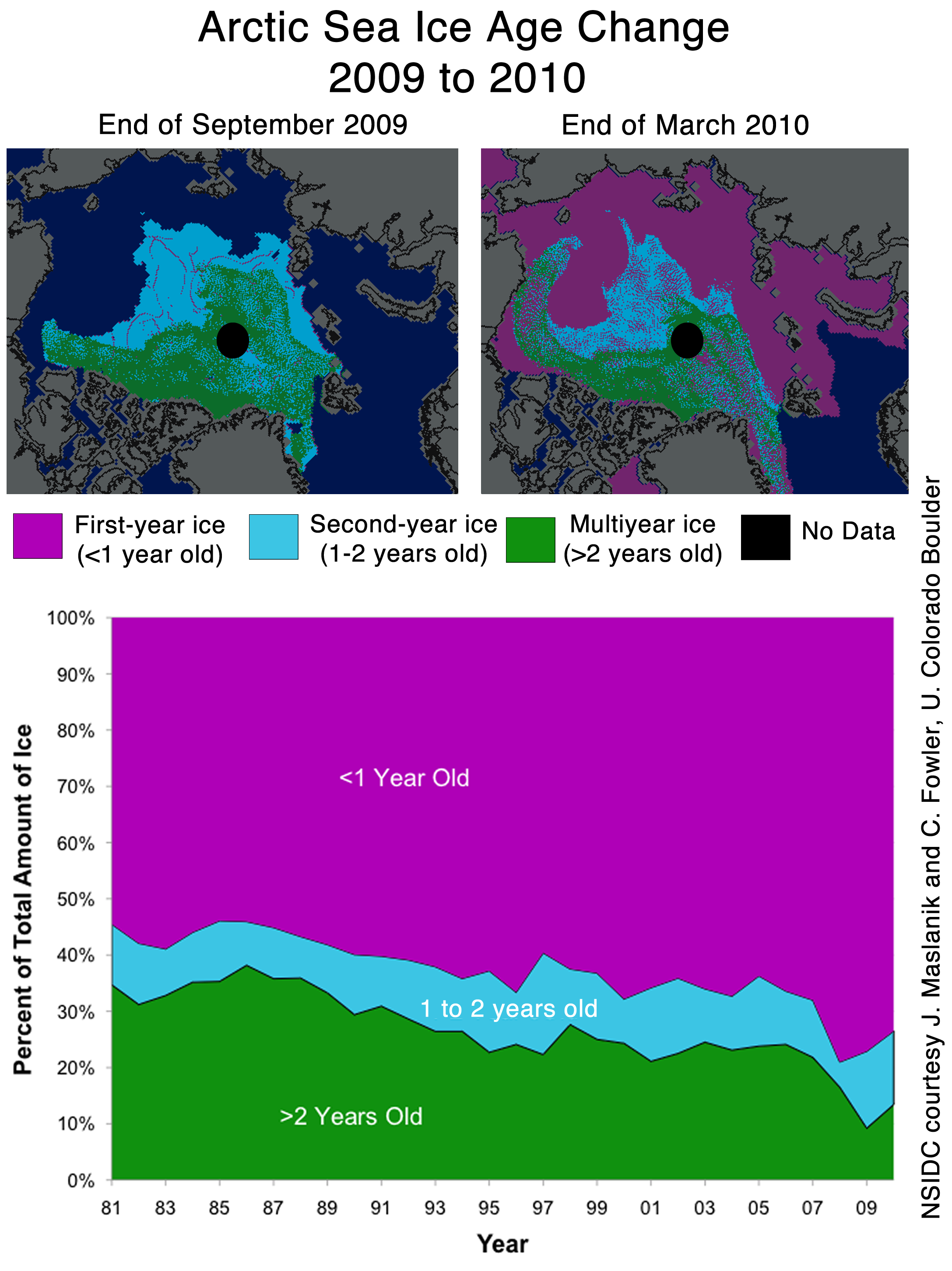
You know that when Steven Goddard comes in to offer expert commentary the argument is profoundly flawed but he pops up here to declare that the chart below, to which I have added a 27-year trend line, is good news for denialists! Go to the NSIDC link and compare the maps of the >2 yr. sea ice extent, shown as green pixels, for Sept. 2009 and Mar. 2010 and tell me what you think of Steven’s claim…

Ignore the 27-year trend, look at that blip in 2009!
Anthony finishes by trying to turn around criticism of his own earlier statements:
Don’t be fooled though. “Decreasing ice is climate. Increasing ice is weather.”
Anthony’s the one who tried to use a short-term increase in sea ice as a global warming disproof. Nothing that happens over a day, a month, a year, even a few years is “climate”, the denialists are the only ones who try to claim otherwise.


Pingback: Let’s believe the ones who understand data « A Man With A Ph.D.
I’ve noticed in other posts that something is awry with the vision of those over at WUWT. There’s a more recent post about temperatures in Montana, which even with their cherry picked start date, shows that it’s been hotter in recent years (most temps since the late 70s are above the average line). They obviously don’t know how to read a graph.
I suppose that’s one reason they prefer charts showing monthly temperature changes over a year to charts showing annual anomalies, because with the former, the scale means the trend is more difficult to see – as in WE’s latest gem. The other reason is that many of them (eg Watts) haven’t figured out what an anomaly is!
Funny, they seem to have moved on to new topics since the Arctic ice extent cratered!