Are huge northeast snow storms due to global warming?

Are huge northeast snow storms due to global warming? Dr. Richard Keen, a buddy of denialist economist Roger Pielke, Jr., guest posts on Anthony Watts’ blog. Did you know that Philadelphia’s weather patterns are proof that lots of snow really does mean colder weather? Take that, Jay Lawrimore of NOAA’s National Climatic Data Center! And of course one useful city is always a refutation of what’s happening over the entire planet.

Now Richard knows you nasty warmists are going to accuse him, again, of cherry-picking a convenient example. So he reminds readers that he chose Philadelphia because he grew up there. That totally lets him off the hook.

An Unexpected Limit to Climate Sensitivity

An Unexpected Limit to Climate Sensitivity. Climate scientists have struggled for decades to accurately determine the sensitivity of Earth’s climate to changes in atmospheric CO2. Citizen-scientist Willis Eschenbach thinks he’s figured it out. It’s not 3℃, if the cartoon version atmospheric model he’s using is right the sensitivity should be 9℃! Clearly those scientists don’t have a clue (this is what we call “foreshadowing”).

Oops. He was measuring the wrong system, and he forgot about “conservation of energy”.

Global Sea Surface Temperature continues to drop

Global Sea Surface Temperature continues to drop. Dr. Roy Spencer returns to say that temperatures are dropping. In one particular short-term satellite dataset (the AQUA satellite’s eight years of AMSR-E sea surface temperature readings). Thus disproving Global Warming.

UAH Global Temperature anomaly published, 1998 still warmest year in the UAH satellite record

UAH Global Temperature anomaly published, 1998 still warmest year in the UAH satellite record. Dr. Roy Spencer declares 2010 and 1998 to be a tie for “warmest year” in the UAH satellite record. So stop talking about the GISS surface temperature records.

Also, Dr. Spencer changes his comparison “base period”:

we have just switched from a 20 year base period (1979 – 1998) to a more traditional 30 year base period (1981-2010) like that NOAA uses for climate “normals”.

An entirely accidental effect will be that “because the most recent decade averaged somewhat warmer than the previous two decades, the anomaly values will be about 0.1 deg. C lower than they used to be.”

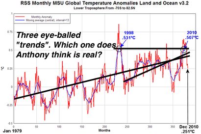
RSS data: 2010 not the warmest year in satellite record, but a close second

RSS data: 2010 not the warmest year in satellite record, but a close second. Anthony Watts discovers that 2010 was merely the second warmest year on the satellite record, although his first version of the chart “proving” this was just a tiny bit exaggerated. Thus disproving Global Warming. Of course the declaration that 2010 is now warmest year was based on surface temperature records, not satellite observations.

Funny how a few days ago denialists were poo-pooing the slightness of 2010’s new record but are now hailing the slightness of their claim that 1998 is still the warmest.

So what was “the warmest year” in Anthony’s preferred dataset? Yes, 1998, the outlier year with a massive El Niño boost which has been the denialist “trick” for several years because it throws off short-term statistical significance. Look for this talking point to be quietly dropped over the year as moment

Pick your story from the satellite temperature observations.

Do solar scientists STILL think that recent warming is too large to explain by solar activity?

Do solar scientists STILL think that recent warming is too large to explain by solar activity? Alec Rawls, an apparently anti-gay, anti-muslim, rigidly partisan failed sheriff, tells us that the temperature anomaly that coincidentally started at the same time as atmospheric CO2 climbed is entirely driven by Sunspot cycle length, somehow. He read it on a commercial weather company’s website.

Those solar scientists and climatologists all have it backwards and wrong. Don’t they know that sometimes there’s a lag in climate response to solar activity and sometimes there isn’t? And that it’s the duration of a sunspot cycle that matters, somehow, not the actual energy output?

Strangely, actual solar scientist Leif Svalgaard disagrees with him at length in the comments.

Antarctic Ice Cores: The Sample Rate Problem

Antarctic Ice Cores: The Sample Rate Problem. Geologist David Middleton returns to tell us that those Antarctic ice cores that seem to support the climatology conspiracy consensus can’t be trusted. After-all, the ice doesn’t permanently capture the CO2 level at the exact instant it begins to form. Also, maybe CO2 got sucked out of the old ice. And everyone knows that only second-by-second CO2 samples can be trusted.

Actually, David is suggesting that the ice CO2 levels blend a bit. He wants us to think that maybe there have been large fluctuations in atmospheric CO2 that have been blurred together and are no longer seen in the ice samples, maybe the modern CO2 trend just happens to be an ordinary large natural swing in CO2, and that we just happen to be at the peak of one of those “swings”.

Although, if the ice cores chanced to suit denialist wishes I’m sure they’d be just fine. In this case the erratic plant leaf stomata CO2 proxy values (sotto voce: does David know that they are a computer model?) are praised because they show large fluctuations that can be used to “prove” that there has been wide variation in the modern era and hence today’s CO2 levels are perfectly natural.

This puzzling quote comes from one of the apparently supporting papers, CO2 diffusion in polar ice: observations from naturally formed CO2 spikes in the Siple Dome (Antarctica) ice core (italics mine):

“Smoothing of the CO2 record by diffusion is one to two orders of magnitude smaller than the smoothing by diffusion in the firn at the depth of 287m (gas age = 2.74 kyr BP) in the Siple Dome ice, and so does not degrade the record.”

So… scientists know about this crazy diffusion thing and have been able to assess it as being insignificant. So what’s David really trying to do?

New paper – “absence of correlation between temperature changes … and CO2″

New paper – “absence of correlation between temperature changes … and CO2″ Anthony Watts proclaims the deliciousness of a new paper by Paulo (not a climatologist) Cesar Soares in the brand-new International Journal of Geosciences, part of the Scientific Research Publishing “empire” (click on that link!), where all the cool papers will now be published. Warming Power of CO2 and H2O: Correlations with Temperature Changes tells us that no correlation exists between CO2 and global temperature, so it must be… something else. Why? Because the response to CO2 variations isn’t instant.

Temperature went up... because there was more water in the air. Or did something happen? Thanks for the blog science, IJG.

Is Soares really trying to tell us that the “correlation” proves that increased atmospheric water is producing warmth? If Anthony buys it, well, maybe we should stop picking on the little rascal…

I’ll leave today’s rebuttal to Greenfyre’s Flimsy post:

For any that think it matters, the paper basically correlates regional weather with solar variation, PDO etc, and then calls it climate.

It’s really too silly to waste any time on, so naturally the Denialosphere will be announcing it as “the final coffin nail” (again).

USA record lows outpace record highs 19 to 1 this week

USA record lows outpace record highs 19 to 1 this week. Anthony Watts wants you to think that “snow” (somewhere) equals “cold” (everywhere) and therefore Global Warming is a fraud. His convincing evidence? One week of US data.

In 2009 Gerald Meehl published a report in ScienceDaily that the denialists have tried to undercut ever since titled Record High Temperatures Far Outpace Record Lows Across US. He used 60 years of data.

60 years beats seven days. Source: ScienceDaily.

The last paragraph in Anthony’s post shows that he knows his headline was not only misrepresentative but also only momentarily accurate (italics mine):

*Note: some people clicking on the interactive map will see different numbers, since that map will record new highs and lows as this post ages. The headline was originally based on 16 highs during the week (see the highs map for a ratio of 21 to 1) then by the time the post editing was completed and the post made, the number of highs was up to 18, giving an 18.6 to 1 (~19 to 1 in the title) ratio. Later in the day the number of record highs in the one week period increased as new weather occurred (on Dec 31) and reports came in. The numbers were accurate at the time the post started. Weather records, like weather itself are dynamic with the forward moving one week period the interactive map generator uses, so please don’t assume error if you click on the interactive map and the numbers don’t match now, or in the future. – Anthony

Prediction is hard, especially of the future.

Prediction is hard, especially of the future. Willis Eschenbach tries to convince us that “problems” with 20 year-old computer models mean that we can’t trust the new ones.

Did Hansen, et. al.’s 1992 prediction Potential climate impact of Mount Pinatubo eruption really “miss the mark”? After all, they did predict a “3 sigma” event and the result was only a “2.1 sigma” event… It seems that they correctly predicted the temperature drop duration but over-estimated the scale. Not too shabby for 20 year-old model run with 20 year-old computer horsepower.

Of course Willis doesn’t give any hard numbers for his suggestion that their prediction “failed”. Couldn’t find an Excel formula for that, Willis?

And how did the much more relevant climate model prediction, 20 more years of increasing global temperatures, work out? Oh yeah, that’s what we’ve had. Willis’ insights are no better that Yogi Berra’s.

This is all just an attempt to prop up denialist obstructionism by suggesting that since we can’t predict the future perfectly we should never take any kind of preventative action at all.