Which NASA climate data to believe?

Which NASA climate data to believe?” Anthony Watts makes a big deal over an accidental data error in the most recent GISS Global Temperature Anomaly (March 2010). The error was quickly corrected at the source, but the cries of “fraud!” are ringing out.

It’s a strange day when even Anthony has to pull in his horns and admit that the evil climatologists have simply made, and corrected, a trivial error.

Where’s the Climate Beef?

Where’s the Climate Beef?” Willis Eschenbach decides he can disprove Global Warming by talking about just the USA. And the WUWT commenters are gobbling it up.

I don’t think anything further needs to be said…

Lies, Damned Lies, Statistics … and Graphs

Lies, Damned Lies, Statistics … and Graphs“. Willis Eschenbach provides what he promises in the title of his post. I would have added “amateur”.

The new math – IPCC version

The new math – IPCC version“. Yet another copy-and-paste job from Anthony Watts. This time its an anonymous analysis from a sites.google.com page.

Wisely detaching themselves from their argument, they chose to confuse real-world temperature trends with synthetic sinusoidal data and declare that the IPCC’s Fourth Assessment Report is a lie(!!!!!!) because the synthetic trend changes with the number of cycles that are included.

If you measure over different distances, you get different slopes! Wow.

Well, duh. Of course it’s comical to suggest that the real-world temperature trends are better represented by a synthetic waveform.

Where are the sine waves???

Let us know when you get out of high school, anonymous!

Response to Dr. Meier’s answer #9 – coin flips in the context of climate modeling

Response to Dr. Meier’s answer #9 – coin flips in the context of climate modeling“. Steven Goddard finds fault with Dr. Walt Meier’s example of coin flipping as an analogy for long-term prediction.

We know that weather models are very accurate for about three days, and then quickly break down due to chaos. There is little reason to believe that climate models will do any better through successive iterations.

His proof? Some seasonal weather predictions that weren’t as accurate as he thinks they should be. Nice try. Steven still feels smugly comfortable concluding thus:

I don’t see much theoretical or empirical evidence that climate models produce meaningful information about the climate in 100 years.

Maybe Steven should open his eyes a bit more. Skeptical Science talks about the success of climate models a bit here.

Arctic Sea Ice Reports: who to believe?

Arctic Sea Ice Reports: who to believe?” Anthony Watts implies deception about Arctic sea ice extent because different organizations (the EU’s “Arctic ROOS” and The National Snow and Ice Data Center at the University of Colorado), using different comparison periods and different methodologies, have slightly different ice extent graphs.

Anthony actually discusses the differences between two methods of calculation, which you’d think would be a starting point for realising that they’re different. But he prefers to lazily imply ulterior motives with statements such as this: “Of course we know that NSIDC director Mark Serreze is very active with the press.

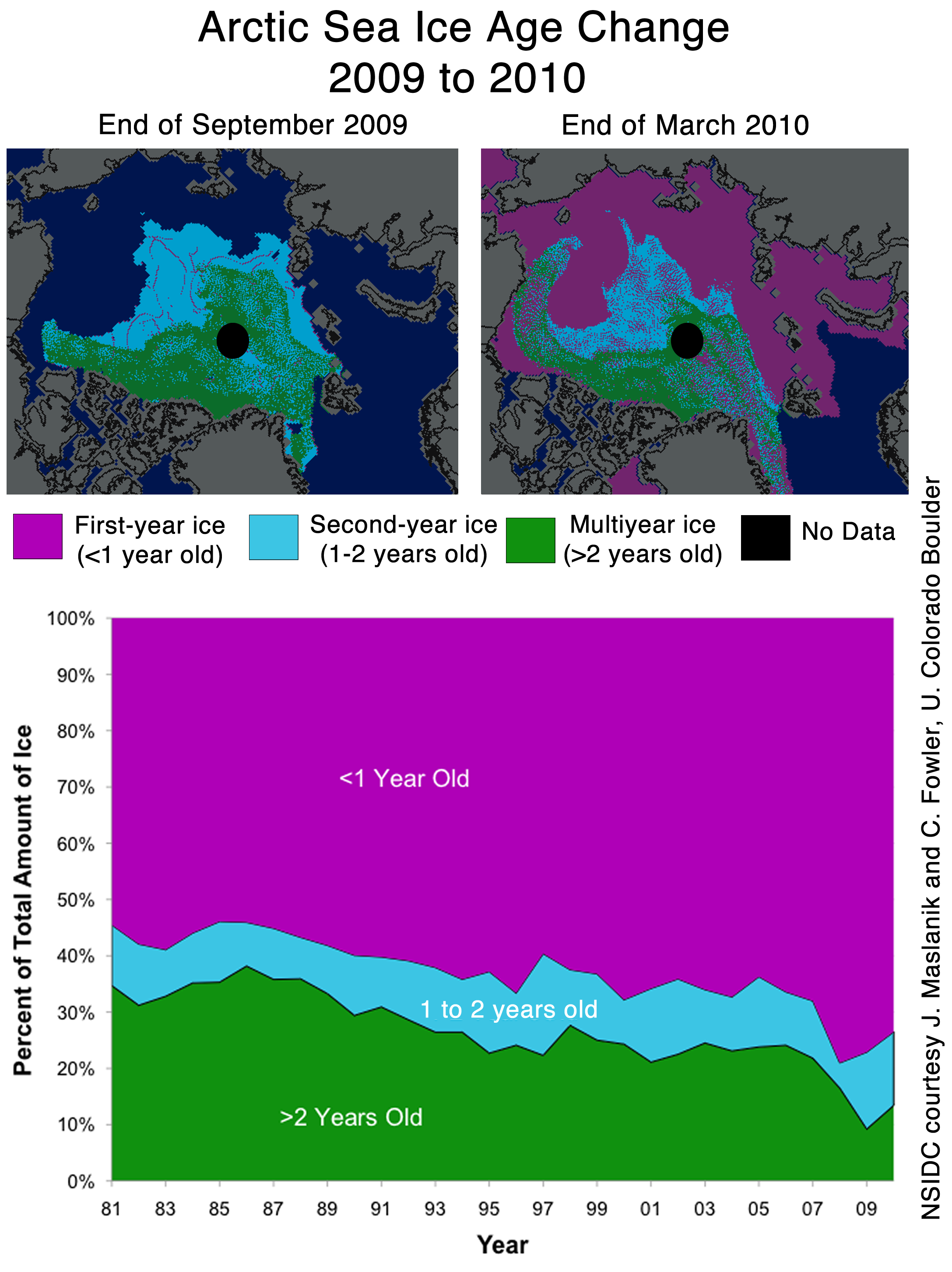
You know that when Steven Goddard comes in to offer expert commentary the argument is profoundly flawed but he pops up here to declare that the chart below, to which I have added a 27-year  trend line, is good news for denialists! Go to the NSIDC link and compare the maps of the >2 yr. sea ice extent, shown as green pixels, for Sept. 2009 and Mar. 2010 and tell me what you think of Steven’s claim…

Ignore the 27-year trend, look at that blip in 2009!

Anthony finishes by trying to turn around criticism of his own earlier statements:

Don’t be fooled though. “Decreasing ice is climate. Increasing ice is weather.”

Anthony’s the one who tried to use a short-term increase in sea ice as a global warming disproof. Nothing that happens over a day, a month, a year, even a few years is “climate”, the denialists are the only ones who try to claim otherwise.

Spaceweather alert – first “red alert” in 6 years

Spaceweather alert – first “red alert” in 6 years” A solar wind substorm is approaching, according to the  Solar Radiation and Climate Experiment (SORCE) satellite. Standby for Global Warming! Actually, this post is fundamentally irrelevant to the Global Warming debate.

Anthony Watts shows this chart of Total Solar Insolation, which I’ve recreated for clarity, that his readers may decide implies that the Sun’s energy output is variable and hence the natural and temporary source of any Global Warming:

Jan-Apr 2010 Total Solar Insolation as recorded by the SORCE instruments. Note highly truncated vertical scale (click to enbiggen).

But isn’t this chart a more honest depiction of the data?

Same data with the full vertical scale used. Click to enbiggen.

The SORCE experiment is sound and the data is good, but it’s hilarious that this deceptive chart is the very next thing that Anthony posts after Frank Lansner’s allegations about IPCC Report chart “tricks”.

IPCC – How not to compare temperatures

IPCC – How not to compare temperatures“. Anthony Watts posts Frank Lansner’s complaint on a favorite subject, alleged flaws in how the IPCC compares temperatures. Frank says that “there are numerous issues discussed intensely when it comes to IPCC-illustrations of historic temperatures” but other than the standard check list of groundless accusations and fabrications, his case really boils down to this: the IPCC is using too many temperature data sources and is averaging them!

So suddenly the problem isn’t lack of data, now it’s too much data. I also have to note with some astonishment that this is a complaint about how the IPCC illustrates historic temperature trends, not about the statistical trends that they are attempting to illustrate.

March Modeling Madness

March Modeling Madness“. Steven Goddard cherry-picks his way around Climate Central’s new interactive depiction of average US March temperatures.

He does this by picking a location that is not predicted to rise above freezing and then claiming that charts confirming this are proof that the models are wrong. He also picks a juicy starting point and uses a scale that obscures any trends that aren’t blindingly large to assist denialists in looking past them.

Next, Steven will prove that water is wet.

Arctic Sea Ice about to hit ‘normal’ – what will the news say?

Arctic Sea Ice about to hit ‘normal’ – what will the news say?” “Hah!” says Anthony Watts. The Arctic sea ice is about to recover all the way to “normal”. That’ll show those Catlin Arctic Survey folks with their tents and sleds!

Arctic sea ice extent on March 29, 2010. Anthony ignores that the variability is mostly in summer. Arctic Regional Ocean Observing System.

Actually it appears that Arctic sea ice is about to reach average extent, which has quite a different meaning. There is little mention of the fact that the meaningful changes are in the summer ice extent. They do bury this quote from Dr. Walter Meier of the National Snow and Ice Data Center deep in their post though and then wave it away:

This has very little implication for what will happen this summer, or for the long-term trends, since the Bering Sea ice is thin and will melt completely well before the peak summer season.