Obituary: Ernst Georg Beck

Obituary: Ernst Georg Beck. Ernst Georg Beck, teacher, blogger and “co-founder of the European Institute for Climate and Energy” and contributor to the disregarded journal Energy & Environment has died. His research interest was to collate historical CO2 chemical measurements, apparently regardless of their source or methodology (they’re all over the place!) and will apparently be “the final nail in the AGW coffin.” If only he’d lived to see the day?

For Anthony Watts an anti-IPCC rant disguised as an obituary is the perfect response. He even lets through comments that ponder whether Beck’s cancer was “given to him in some shape or form by those with a vested interest in such things as global governance.” Alway the high ground with Anthony…

RC’s response to McShane and Wyner: a case of orange cones

RC’s response to McShane and Wyner: a case of orange cones. This is a classic whine from Anthony Watts about “the Team” and their “egos”. Gavin Schmidt, Michael Mann, and Scott Rutherford (apparently representing the Team) have written a scathing comment letter to the Annals of Applied Statistics about the recent allegedly “hockey-stick busting” paper by the naïve statisticians McShane and Wyner entitled A Statistical Analysis of Multiple Temperature Proxies: Are Reconstructions of Surface Temperatures Over the Last 1000 Years Reliable? [PDF].

Update: I just noticed that the URL for Anthony’s blog post is “http://wattsupwiththat.com/2010/09/23/rcs-response-to-mcshane-and-wyner-the-teams-steaming-pile-of-snip”! Now that’s critical analysis.

The paper has been debunked as wishful thinking and statistical failures (particularly embarrassing if you’re trying to overturn statistical evidence) that rely heavily and uncritically on biased sources and is coated with an irrelevant layer of political posturing. Read the coverage at Deep Climate, or Deltoid, then have a chuckle over Anthony’s first coverage of this “new and important study“. It has proven to be the latest superficially useful denialist effort, so it is being blindly praised in the usual quarters and stubbornly defended by the ignorant (this is Anthony’s cue).

I’d summarize it as an attempt to claim that the weak results of their poor statistical analysis means that the better techniques used to successfully identify the “hockey-stick” temperature trend are invalid. Sort of like saying “we get crappy results, so you must have done a crappy job just like us.”

Anthony jumps in with both feet sputtering about the nerve of those climatologists pointing out improper “data quality control” in McShane and Wyner’s paper. It’s one thing for denialists to fabricate quality control criticisms and splash them about freely, but apparently poor sportsmanship for scientists to point out real data flaws. Even if M&W tried to preëmptively claim that they’re “not interested at this stage in engaging the issues of data quality.” (Except they are.)

M&W are also called out for adding “poor quality proxies [that have] a material effect on the reconstructions, inflating the level of peak apparent Medieval warmth”. Why can’t they spin the climate record for the benefit of their desired conclusions? It’s standard practice for denialist papers! Sorry Anthony, M&W have to play by the big kid’s rules. What M&W did was to throw back in all garbage data they could to try to cherry-pick their way to an inconclusive trend.

And all this adds up in Anthony’s mind as mere wounded egos on the part of some pesky climatologists…

Arctic isolated versus “urban” stations show differing trends

Arctic isolated versus “urban” stations show differing trends. Anthony Watts has a serious man-crush on anyone who shares his obsession with weather station micro-analysis. Today’s candidate is mechanical engineer Pierre Gosselin, who loves the “gate” suffix and knows that “climate change” is a religion. He sets us all straight on how them dang climate scientists have it all wrong.

Correction: the analysis is by Pierre Gosselin’s “guest author” Ed Caryl, whose credentials seem limited to being a balding white male who likes to parrot that Antarctic ice is expanding. But that’s better than most of Anthony’s esteemed sources.

Apparently any collection of more than two people constitutes an urban setting and hence all that Arctic warming must be discounted as the product of the notorious Urban Heat Island effect! Except there isn’t an Urban Heat Island bias in the weather station records…

All the usual cherry-picking and statistical ignorance (“Looks like an awfully good fit”) are present. Arbitrary selection of “useful” weather stations, comparing carefully chosen “peak to peak” comparison points, reams of amateur photos and charts, uninformed mutterings about station histories, invoking long-duration natural cycles that we should wait out for better understanding.

Noise and dishonesty. Amusingly, Gosselin’s own website is called No Tricks Zone.

Analysis of NSIDC August 4 News

Analysis of NSIDC August 4 News. Steven Goddard still thinks that he can use Photoshop to disprove Global Warming! Friendly advice for Anthony Watts: I know Steven helps fill your blog with denialist arguments of varying quality, but his premises are invariably based on either stubborn ignorance or deliberate analytical flaws. Although perhaps you don’t care?

So what’s Steven’s “analysis” this time? He claims that the NSIDC’s (National Snow and Ice Data Center) Sea Ice News has a deceptive chart of Arctic Sea Ice Extent because his pixel counting from an NSIDC map shows 10% more ice now that in 2007. That’s not what the chart shows! Although it goes right over Steven’s head, Dr. Walt Meier of the NSIDC charitably explains;

Our sea ice maps are not an equal area projection. Thus one cannot compare extents by counting grid cells – this is probably the reason for the 7.5% vs. 3% discrepancy. Steve has been alerted to this issue in the past, but seems to have forgotten it.

Photoshop also proves that Arctic multi-year ice is doing just fine, sort of, even though the NSIDC says that it is melting in the southern Beaufort Sea. So there.

Finally, Steven lets us know that Sea Ice Extent is increasing in the Antarctic, naturally disproving Global Warming. Too bad Antarctic Sea Ice Extent is driven by ocean current patterns and glacial outflow and not temperature.

Goddard notes grandly that he has “alerted Dr. Meier to most of these issues by E-mail.” Another trophy for the lunch-room bulletin board I suppose.

DMI polar data shows cooler Arctic temperature since 1958

DMI polar data shows cooler Arctic temperature since 1958“. Frank Lansner joins Steven Goddard’s love-in with the Danish Meteorological Institute (DMI). Their Arctic climate modeling in the 80° – 90° latitudes seems to show cooler average melting season (“summer”) temperatures than the GISS model. Thus proving that Global Warming doesn’t exist. Evil “garbage in-garbage out” “adjusted” computer models are just fine if they tell Frank and Steven what they want to hear apparently.

Why the difference between DMI’s estimates and those from GISS? It doesn’t seem to matter to Frank as long as he can wave one of them around accusingly.

Discrepancies In Sea Ice Measurements

Discrepancies In Sea Ice Measurements. Steven Goddard returns for the second time today to prove, via Photoshop, that climatologists are tricking us. The National Snow and Ice Data Center (NSIDC) and Danish Meteorological Institute (DMI) Arctic Sea Ice Extent plots aren’t identical!!!!!

Because they use different modeling techniques that have different break points for ice/not ice. So what?

Of course Steven is really trying to avoid talking about Arctic Sea Ice Volume, which is much less useful for sowing denialist confusion. We’ll stick with extent though and post this image for Steven to chew on:

Average monthly Arctic Sea Ice Extent trend since 1979. Source: NSIDC.

A color scheme change for the SST map

A color scheme change for the SST map“. Steven Goddard still thinks that diddling around in Photoshop is scientifically meaningful. Today he tries to jigger the color scheme to reduce the global temperature anomalies by using a “cooler” color for small positive anomalies.

Of course he had to hunt around the NOAA site to find the Coral Reef Watch group’s variation on the master Sea Surface Temp anomaly map to find a chart that he could make look bad. Note to Steven: Charts are representations of data, they are not data. What you are doing is discarding the data that you don’t like.

Here's a real NOAA SST Anomaly Map, for August 4, 2010.

Using the same logic Steven “proves” in the comments that, by geographical area, President Obama only got 28% of the 2008 Presidential election vote.

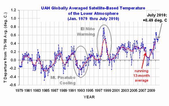
UAH Global Temperature – still in a holding pattern

UAH Global Temperature – still in a holding pattern. Thanks for the weather observation from Roy Spencer, Anthony. I wonder if Anthony will ever stop pretending not to understand that good old natural climate variation, such as the eastern Pacific Ocean El Niño circulation pattern, will continue while the progressive human impacts express themselves. It’s not either/or.

It’s well understood that natural “cooling” climate variations can suppress the man-made rise, but when they swing back to “warming” they will magnify it. All Anthony is doing is pretending that these pauses are significant. “Expect drops in the months ahead” says Anthony. So what? But it will be interesting to watch him squirm out of his meaningless prediction if it fails to come to pass.

UAH Global Temperature, 1979 - present

Interesting admission from Dr. Spencer:

As of Julian Day 212 (end of July), the race for warmest year in the 32-year satellite period of record is still too close to call with 1998 continuing its lead by only 0.07 C.

Doesn’t sound like cooling to me. Spencer and sundry denialists are still clinging to that crazy 1998 El Niño as the answer to the painfully obvious warming trends.

A new must read paper: McKitrick on GHCN and the quality of climate data

A new must read paper: McKitrick on GHCN and the quality of climate data“. Economics professor Dr. Ross McKitrick of the University of Guelph has performed a comprehensive review of the GHCN surface and sea temperature data set! It’s published in… Oh, it’s a vanity publication by his denialist friends at The Global Warming Policy Foundation.

Anthony Watts’ associates keep trying to repackage the accusation that the temperature data sets are untrustworthy and hence there is no Global Warming, but they can never make it stick. This time McKitrick even tries to slide in a few “Climategate” e-mails for support. Let’s look at the two excerpts that Anthony posts:

1.2.3. Growing bias toward lower latitudes – This actually biases against warming. McKitrick tries to float the idea that “this implies less and less data are drawn from remote, cold regions and more from inhabited, warmer regions.” In fact it’s well established that the warming anomaly is more pronounced at higher latitudes. Either McKitrick is uninformed or he’s trying to mislead readers.

2.4. Conclusion re. dependence on GHCN – Another canard from Ross, claiming that “All three major gridded global temperature anomaly products rely exclusively or nearly exclusively on the GHCN archive”. Guess what? There aren’t large overlapping collections of weather stations around the world. What climatologists interested in historical temperature trends do is select stations from the larger group that meet their analytical requirements. Good morning Rip Van Winkle.

Walking the Plank-ton

Walking the Plank-ton“. More awesome marine biology insight from Willis Eschenbach. He waited until he had a chance to read the entire Global phytoplankton decline over the past century paper in Nature because he didn’t want to get it wrong. The paper’s claim is that our marine phytoplankton population has been cut in half since 1900 because of warming of the global oceans.

So what did Willis come up with to reject the paper’s conclusions? This:

The short answer is that I don’t know … but I don’t believe their results.